
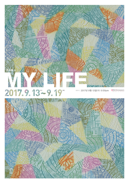
가을맞이 특별기획
권시숙 초대展
MY LIFE
![]()
갤러리 그림손
2017. 9. 13(수) ▶ 2017. 9. 19(화)
Opening 2017. 9. 13(수) 5:00pm
서울시 종로구 인사동10길 22 (경운동 64-17) | T.02-733-1045
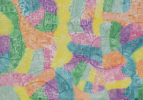
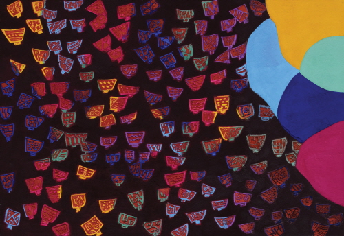
MY LIFE_장지에 석채와 분채_162x112cm_2016
권시숙의 석채도필화, 인생이 투영된 나만의 기록이다
글_김윤섭(한국미술경영연구소장 · 미술사 박사)
인생(人生)이란 참으로 각양각색이다. 저마다의 사연에 따라 여러 얼굴이다. 공통점이라면 ‘사람의 살아 있는 동안’ 혹은 ‘생명을 지닌 채 살아가는 시기’를 뜻한다는 것 정도이다. 결국 ‘살아 있어야’ 인생인 셈이다. 그래서 인생이란 ‘한번뿐이 없는 기회’이며, 지나가는 바람처럼 ‘휩쓸려가는 허망한 시간’에 빗대기도 한다. 권시숙 작가가 작품의 명제를 일괄적으로 <My Life>라고 붙인 까닭도 남다른 의미로 다가온다. 때론 보름달처럼 풍요롭지만, 깊은 바다 속처럼 중후함을 발산한다. 쉽게 단정할 수 없는 매순간 인생의 결들을 조심스럽게 쓰다듬는 진지함도 묻어난다.
권시숙 작품의 특징 중 눈에 먼저 들어오는 것은 단연 독특한 색채감각이다. 겉보기엔 다소 무겁거나 어두워보여도 깊게 들여다볼수록 밝고 화려한 색감이 근간을 이룬다. 흔히 오방정색(五方正色)과 오방간색(五方間色)이라 불리는 색감이 효과적으로 운용됐기 때문이다. 처음 구상단계부터 마지막 마무리 순간까지 앞서거니 뒤서거니 ‘오방색 하모니의 균형’을 조율해나간다. 화면 전반에 흐르는 특 의 경쾌한 리듬감 역시 권시숙만의 기묘한 혼색의 비법이 빚어낸 결과이다. 마치 도공(陶工)이 흙속에 양극의 물과 불을 한 몸으로 빚어내듯, 권시숙은 빛과 어둠의 균형으로 새로운 생명력을 창출해내고 있다.
작품 전반의 색감을 좌우하는 것은 안료의 역할이다. 얼핏 부드럽게 보이지만, 화면의 표면은 돌처럼 단단하고 촉감은 거칠다. 분말 안료와 함께 다량의 석채(石彩)를 사용했기 때문이다. 석채는 말 그대로 ‘미세한 돌가루’로 이뤄졌다. 쉽게 변색되지 않고 보존력이 강해서 예로부터 귀하게 여겨졌다. 하지만 권 작가의 작품에선 석채가 아낌없이 사용된다. 재료 특성상 혼색이나 착색이 수월치 않음에도, 수많은 실험과정을 거쳐 이젠 수십 단계의 색감을 자유롭게 연출해낼 수 있을 정도가 됐다.
그런데 작품을 구성한 표현기법이 참 특이하다. 바탕의 화려한 밑 색이 비칠 정도로 자연스럽게 쓱쓱 긁어낸 흔적들이 역력하다. 분명 돌가루가 섞인 안료를 깔끔하게 밀어내듯 스크래치 기법을 구사하긴 쉽지 않았을 것이다. 권 작가의 그림은 여느 붓 그림으론 도저히 불가능한 조형어법을 보여준다. 돌을 새기는 예리한 전각용 조각도로 상형문자의 암각화를 완성해가는 과정을 닮았다. 또한 아마도 오랜 세월 뒤안길의 에피소드를 품고 발굴된 막사발 혹은 다기 형상들을 화면 전면에 배치했다. 그런데도 태고의 역사성과 현대적 미감을 동시에 자아낸다.
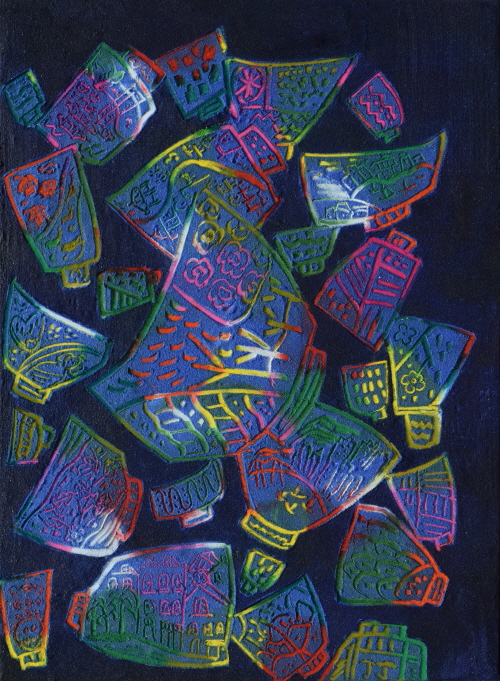
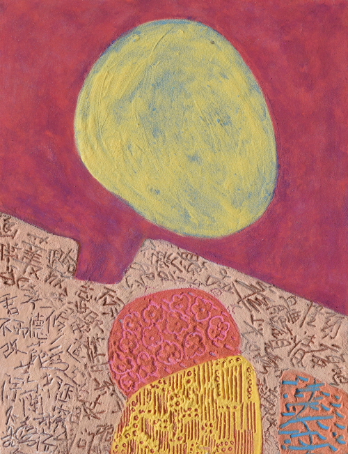
MY LIFE_장지에 석채와 분채_72.7x53cm_2017
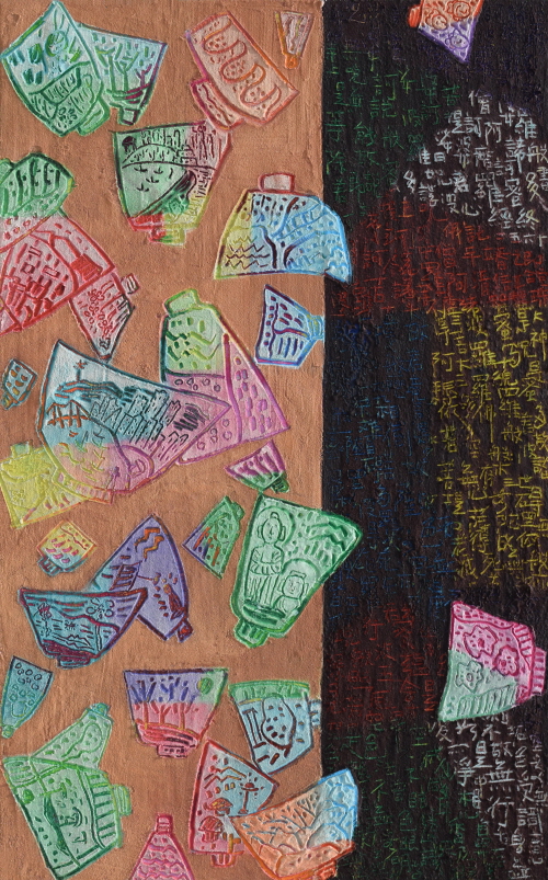
다기(茶器) 형상 안엔 지금의 흔한 자연의 모습에서 도심 풍경, 온갖 풍물들의 흔적들로 채워졌다. 다른 바탕 면엔 한자들로 빼곡하게 차지한 예들도 있다. 역시 긁고 새긴 기법은 같다. 상형문자처럼 최대한 단순화 시킨 형상의 표현, 끊고 맺음이 분명하게 처리된 서예의 필흔까지 함께 등장한 이유가 있다. 권시숙 작가는 원래 지금의 회화작품 이전에 서화(書畫) 활동으로 입지를 다졌다. 오랜 세월 몸에 밴 서예와 문인화의 특별한 감각은 지금의 회화작품에도 고스란히 그 명맥이 이어진 셈이다. 결단력이 도드라진 간결성과 절제된 속도감이 유지된 ‘권시숙의 도필화(刀筆畵)’는 우리 인생이 고스란히 투영된 기록들이다.
권시숙 작품에서 아주 흥미로운 점은 독창적인 여백에 대한 재해석이다. 전반적으로 촘촘하고 세세한 화면구성 가운데, 어느 한쪽에 갑자기 등장하는 오방색 조각퍼즐면의 대비가 그것이다. 마치 색동조각보가 덮고 있는 형국이다. 어떤 면에선 어른거리는 오방색 밑 색의 존재감을 재확인 시켜주는 것 같기도 하다. 그것이 어떤 측면이든, 분명한 것은 오방색 조각퍼즐 면들이 빼곡한 화면에서 숨통을 트여주는 역할을 한다는 점이다. 이것은 우리 전통회화나 문인화에서의 여백 개념과 다름없다. 서로 다른 차원의 경계가 공존하면서도 상호상생의 미학을 연출한다.
그렇게 보면 권시숙의 색동퍼즐 여백이 지닌 멋스러움은 삶의 여유를 찾는 또 다른 방법론의 제안과도 같다. 빡빡한 현대인의 도심 속 일상에서 잠시라도 자유의 일탈을 꿈꾸게 한다. 권시숙의 최근 신작들은 오는 9월 13일부터 19일까지 진행되는 인사동 그림손갤러리의 개인전에서 만나볼 수 있다.
MY LIFE_장지에 석채와 분채_116.7x72.7cm_2017
Kwon Si Sook’s Painting with Colored Stone Powder;
Life Projected in Artist’s Own Writing
Diverse is the life... and, a unique façade is displayed by the story one’s life holds. The common feature among such lives would merely be “the period of existence”. After all, life happens by being “alive”. Therefore, life may be regarded as the only chance we’ve got, but, on the other hand described as “time vainly blown away”. How Artist Kwon Si Sook integrally titled all her pieces to be “My Life” moves one to ponder the meaning of life itself. The artworks are at times as opulent as the full moon, yet dignified as the abyss of the sea, while they carry the sincerity of stroking the undefinable moments in life with calm gentleness.
The first grasping attractiveness of Kwon’s artworks lies definitely in the unique colors. Seemingly dark and grim at the first encounter, profound gaze reveals their vibrant colors on the foundation. The result is due to efficient application of “Obang monochromatic colors (the five Korean traditional colors; blue, red, white, black, yellow)” and the In-between colors among Obang color palette. From the initial contemplation to the stage of finishing touches, the Obang colors are harmoniously tuned. The uniquely blithe rhythm that flows throughout the canvas is also created by Kwon’s magical blend of colors. Just as a potter unites water and fire in mud for the two bipolar elements to coexist, Kwon Si Sook creates a new life through balancing light and darkness.
The color flow in artworks is created by the color pigments. They look soft at the first glance, but the surface of the canvas is rough and solid as rocks. A large amount of ground stone is used with powdered paint. Thus created is the “colored stone powder”, which has always been considered valuable due to its durability and non-discoloration. Such precious colored stone powder is used generously in Kwon’s artworks. This coloring ingredient is extremely challenging to mix or paint with, but through multiple and untiring experiments, the artist has gained skill proficient enough to freely generate various desired colors.
The painting technique is another distinctive quality. It is apparent that the colored stone powder is gently brushed in the right amount for the base painting to be visible. It certainly couldn’t have been an easy task to execute such clean scratching technique when the media is powdered stone. Kwon’s artworks demonstrate painting technique that is impossible to accomplish using a mere paint brush. The process
resembles that of carving out a pictograph with a fine knife. The shapes of historic drinking bowls or tea cups that seem to carry ancient episodes are arranged in the front. The primitive historicality and modern sense of beauty coexist in one piece.
MY LIFE_장지에 석채와 분채_91x116.7cm_2017
Within the shapes of tea cups are the drawings of modern city landscapes and various common sceneries from nature and daily life. Some other pieces have Chinese characters filled in the background. Scratching and carving technique is consistent through her artworks. There is a reason behind such simplified shapes in the style of pictograph, and how the trace of clean-stroked calligraphy emerge together on canvas. Kwon Si Sook was formerly renowned through her calligraphic works and paintings prior to her recent fine art pieces. The exceptional aesthetic sense developed through years of practicing calligraphy and literary art is carried on and paraded in the artworks she creates now. “Kwon Si Sook’s Paintings with Colored Stone Powder”, which maintain the simplicity manifested by determination and composed speed, are the artist’s own writings of our lives projected.
The interesting factor in Kwon Si Sook’s artworks is the ingenious reinterpretation of space. In the dense composition on canvas, the Obang colors in patchwork suddenly emerge on a side. This is as if Sekdongjogak-bo (Traditional Korean style rainbow-striped patchwork) is covering the artwork. It seems to reconfirm the presence of foundation colors wavering under Obang colors. What’s undeniable is that the patchwork of Obang colors establish a breather on canvas. It is the same concept as utilizing space in Korea’s traditional or literary paintings. The boundaries between differing dimensions coexist as they mutually demonstrate aesthetics.
The beauty exuded by such space from the Sekdong patchwork may be considered as a new suggestion of encouragement to seek a break from this hectic life. Come weary from the restless modern society, the viewer is led to have a sweet escape, even if for a short while.
Written by Yoon-Sub Kim, Ph. D (Chief of the Korean Arts Management Institute, Doctorate in Art History)
MY LIFE_장지에 석채와 분채_53x41cm_2017
■ 권시숙(1960~)은 동국대학교 문화예술대학원을 졸업하고, 국내외에서 17회(서울 · 부산 · 무안 · 프랑스 · 포르투칼)의 개인전을 가졌다. 또한 홍콩 · 베이징 · 서울 등 21회의 국내외 아트페어와 교보아트스페이스 기획초대전(색 피어 오르다 2017) · LA Nuit DES Gaieries(2017 프랑스) 등 140여 회의 단체전에도 참여했다. 그동안 대한민국미 대전 · 행주미술대전 · 전남미술대전 · 경기미술대전 등의 심사위원을 역임했고, 대한민국미술대전 국무총리상 및 특선 2회 · 목우공모미술대전 최우수상 등을 수상했다. 현재에는 대한민국미술대전초대작가, 프랑스 갤러리TreS 전속작가, 사단법인 한국미술협회 회원, 한국화동질전 회원, 출35 회원 등으로 활동 중이다.
vol.20170913-권시숙展