
서명희 | Seo, Myung-Hie
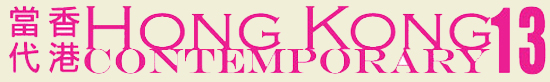
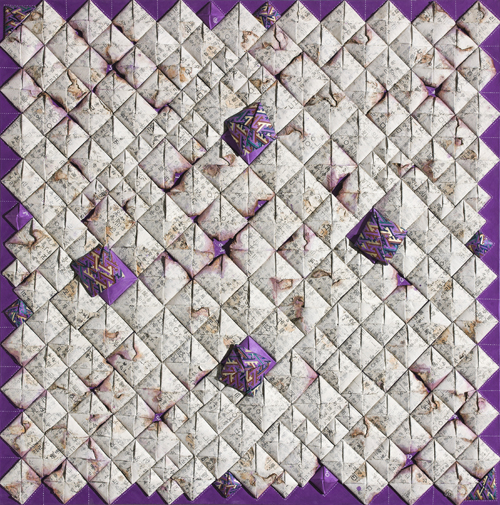
Being&Non-being_1301_45x45cm_Mixed Media on canvas_silk fabric
Moon Gallery
2013. 5. 24(금) ▶ 2013. 5. 27(월)
Shop 1, G/F, Hua Fu Commercial Building, 111 Queen's Road West, Hong Kong
T.852-2858-1771 | F.852-2736-6361
www.moongallery.org | 서명희 YouTube 보기 ▶클릭
Being& Non-being1212_60x60_Mixed media on Canvas,silk fabrics,sewing_2012
부재하는 기억의 회상
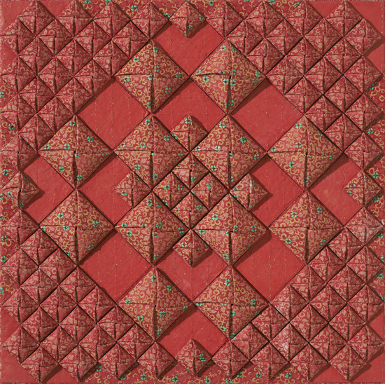
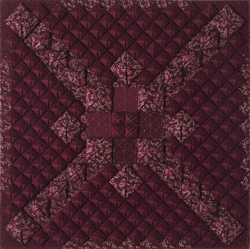
서명희의 작업은 수공의 공예적, 부조적 작업과 손맛으로 채워진 회화가 공존한다. 두 작업 모두 간결하고 압축적이다. 상당히 미니멀 하다고 할까? 깔끔한 디자인적 감성과 정연한 구성이 돋보인다. 작가가 다루는 사각형의 박스형 딱지와 세일러복이란 두 이미지, 상징은 다르면서도 사실은 동질의 것으로 다가온다. 이 두 상징은 다르면서도 사실은 동질의 것으로 다가온다. 이 두 상징은 다르면서도 사실은 동질의 것으로 다가온다. 조각보나 방패연을 연상시키는 사각형의 딱지 모양은 화면에 마치 타일처럼 부착되어 있다. 이 작품은 수공예 적 이고 부조, 조각적이다. 엄청난 시간이 요구되고 하나하나 손맛을 요구 하는 번거롭고 집요한 작업이지만 작가는 무엇보다도 재미있는 작업이라고 한다. 본인에게 재미있고 감동적인 작업이 무엇보다 중요하다는 것이다. 정성껏, 중심부위로 약간 융기되도록 조율해서 조심스럽게 접은 통통한 사각형의 단위들은 격자형의 무늬를 만들어 보이기도 하고 방사형으로 촘촘히 화면을 채우기도 한다. 이 요철효과는 종이의 질감과 물성, 그 위에 인쇄된 문자 이미지, 기호 그리고 색상,그리고 그 위로 스며든 물감에 의해 다양한 변화를 전체적인 통일성 안에 잔잔히 심어놓고 있다. 여러 개별적 사연들이 모여 한 시간, 공간을 채우고 있다는 메시지 같다. 또한 소중하게 하나하나의 사연, 공간이 모여서 지난 시간대를 구성하고 있음을 보여주는 듯 하다. 그런 의미에서 사각형 역시 기억, 회상, 과거의 사연등과 깊숙이 연관되어 있어 보인다. 이렇듯 고문자가 인쇄된 종이를 딱지로 접어 화면에 부착한, 일종의 저부조, 입체적이며 촉각적인 작업과 함께 소녀들이 착용하는 세일러복만이 돌올하게 그려진 회화작업은 다소 상징적이면서도 공통적으로 기억, 회상, 빛바랜 추억들과 같은 회고적 감정과 연관되어 있어 보인다. 기존에 존재하는 이른바 레이디메이드이미지인 문자가 인쇄된 종이, 한지라는 오브제는 복수의 존재들이 집적 결합이란 구성적 체계 속에서 화면을 가득 채우고 있다. 일일이 손으로 접고 물감에 적셔서 이룬 작은 사각의 단위들이 하나의 화면을 만들고 그 하나의 평면 안에는 또 다른 작은 평면의 세계가 채워져 있다. 부분과 전체는 그렇게 유기적으로 연결되어 있다. 어쩌면 이 작은 단위는 개별적인 사연, 기억의 단위일 것이다.
작가는 자신의 내밀한 사연, 아득한 시간의 흔적, 그리고 형상화될 수 없고 가시적 존재가 되지 못하는 막막한 것들을 사각형의 딱지 형태와 세일러복의 이미지를 통해 보여주고 있는 셈이다. 이렇듯 작가의 작업은 도상적 연출을 통해 사적인 이야기를 구성하고 그리기와 만들기, 회화와 조각, 공예를 넘나들면서 화려한 매체연출과 집요한 노동을 통해 지난 시절을 은유화 내고 있다,
박영택(미술평론, 경기대 교수) 평론 중
Being& Non-being1211_50x50_Mixed media on Canvas,silk fabrics,sewing_2012
Remembering Absent Memories
Craft and co-exist with hand-painting in Seo Myung Hie’s work. Both works are simple and compact. I would say they are very minimal. Neat design-sensitivity and ordered structure are design-sensitivity and ordered structure are distinguished. Two images worked by the artist, which are quadrangular box-type label and sailor suit, stand for different symbols but represent the same. Those two symbols billow thicky on the surface causing strange illusion.On the other hand, quadrangular label is attached on the canvas as if it were a piece of tile, reminding us of patchwork or shield-shaped Kit. This work is handicraft relief. and sculpture-like image. It demands tremendous amount of time and hand skills one by one, but the artist says it is funnier than anything else. She says that any work interesting and impressive for herself is the most important of all. Thick Quadrangular units carefully that is folded after being tuned to uplift carefully that is folded after being tuned to uplift in the middle part display grid pattern sometimes, or dense radial work to fill canvas. This uneven effect has quitely planted various changes in the overall unity through colors that are permeated on the texture, material feature, as well as letter images, symbols and colors printed on the paper. It is like a message where individual story gathers to fill in one time and space. It also look like to show each story and space which is preciously uplift, to show consising of the past time. In that sense, this quadrangle also seems to be closely connected with memory, recollection, and stories of the past.
Such a painting where only girls’ sailor suits are discerningly painted with low-relief, cubic and tactile work and where the printed with old letters is folded as a label and is attached on the canvas seems to be tied with memory, recollection, and faded reminiscence in common, although they ate somewhat different from one anther. The paper where current so-called ready- made image letters are printed, the canvas in the organizational system where multiple existence gather and is united with each other. small quadrangular units which are folded by hand one by hand one by one and drenched in colors, make one flat screen which is filed with other small flat screen which is filled with other small flat ones. Part and whole are so organically connected like this, This small unit might be an individual story, the unit of mimory.
The artist seems to be show her own secret story, trace of remote time, and dim things which can neither be out nor exist visually, through the quadrangular label and the image of sailor suit. Lake this, the artist is making a metaphor of the past time through splendid medium performance and persistent labor, hanging over painting, sculpture, and artcraft, and consisting of private stories by figurative display.
Extracted from review
Bening& Non-being1105_130x130_Mixed media on Canvas,silk fabrics,Korean paper_2011
Memory_194x131_Mixed media on Canvas,fabrics,sewing_2011
■ 서명희
국민대학교 조형대학 졸업
2003 1st 인사 갤러리, 서울 구미 문화예술 회관 | 2005 2nd KOEX, 서울 | 2005 3rd 갤러리 인사 아트 프라자, 서울 | 2007 4th 갤러리 가이아, 서울 | 2007 5th Art Center Berlin, 독일 | 2008 6th PLEXPO, 제네바, 스위스 | 2009 7th 갤러리 호, 서울 | 2010 8th 봄 갤러리, 과천 | 2010 9th 갤러리 하미강, 서울 | 2011 10th 조선일보 미술관, 서울
International Art Fair | 2008 Europe Art Fair (Geneva, Switzerland) | 2009 C.I.G.E (Beijing, China)/Line Art Fair (Belgium) | 2010 Shanghai Art Fair (Shanghai, China)/Daegu Art Fair (Daegu) | 2011 K.I.A.F (Seoul) | 2012 ART KYOTO Hotel Art Fair (Kyoto, Japan)/K.I.A.F (Seoul)
Graduation of Kookmin University Design College | 2003 1st Insa Gallery, Seoul, Gumi Cultural Center | 2005 2nd KOEX, Seoul | 2005 3rd Insa Artplaza Gallery, Seoul | 2007 4th Gallery Gaia | 2007 5th Art Center Berlin (Germany) | 2008 6th PLEXPO, Geneva, Swiss | 2009 7th Gallery Ho, Seoul | 2010 8th Bom Gallery, Gwacheon-si | 2010 9th Gallery Ha Mi Gang, Seoul | 2011 10th Gallery Chosun, seoul
E-Mail | sh3377@empal.com
vol.20130524-서명희展