
이영희 초대 展
오색찬란한 무지개
Korean Five Colors Rainbow
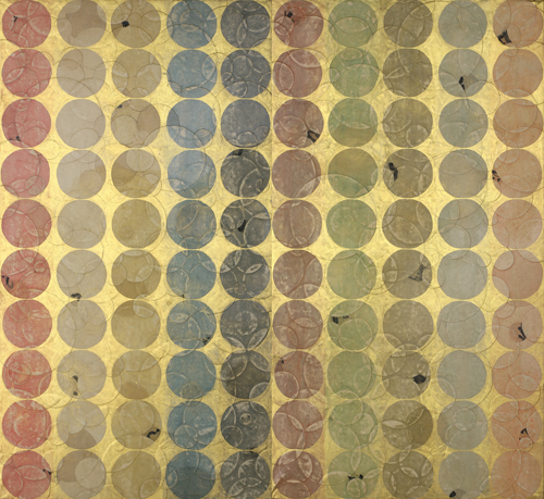
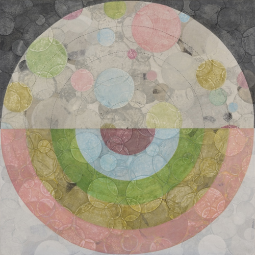
오색무지개_110x120cm_장지.자연염료.분채.먹.콩즙.금분_2010
나무그늘Gallery
2010. 3. 1(월) ▶ 2010. 3. 20(토)
별도의 초대일시 없습니다
서울시 영등포구 영등포4가 경방타임스퀘어단지/02-2638-2002
나무그늘 갤러리는 1936년에 건립된 경성방직공장 건물로 서울시 문화재 제135호임.
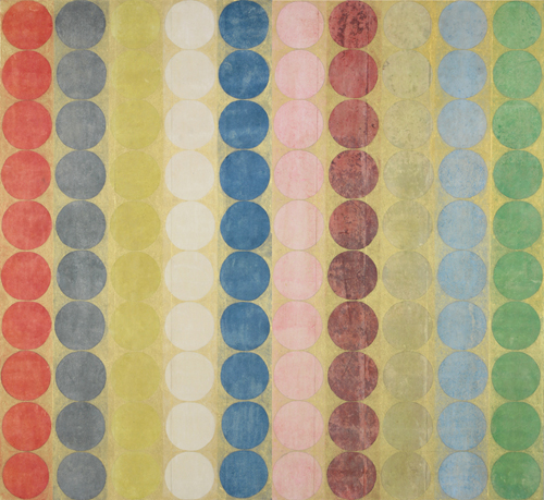
오색무지개_110x120cm_장지.자연염료.분채.먹.콩즙.금분_2010
‘오색찬란한 무지개’는 개항 전까지 우리나라에서 표현 돼왔던 색의 개념이었으나
오늘날 우리는 서구의 ‘일곱 색 무지개’밖에 모르고 있다
-작가노트 중에서-
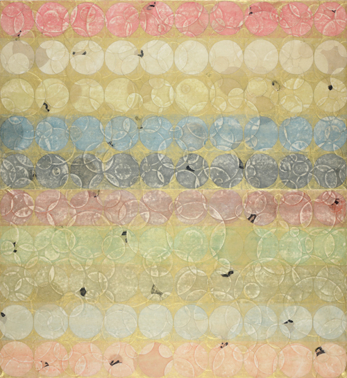
오색무지개_110x120cm_장지.자연염료.분채.먹.콩즙.금분_2010
치유의 오색무지개
박옥생/미술평론가
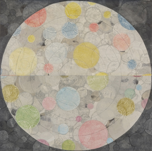
1. 한지와 오색이 만나다.
작가 이영희는 한지의 물성과 그 위에 무한하게 펼쳐나가는 오색의 색채가 가진 정신성과 전통성에 오랫동안 고민해 왔다. 그 동안 작가는 색으로 풀어내는 시간의 궤적(역사)과 타자와의 소통을 조형화하였다면 근자에는 색으로써 정신적, 관념성까지 끌어올리는 내면을 관조하는 단색조의 화면으로 변모시켰다.
이영희의 회화세계에는 두껍고 단단한 장지(壯紙) 위에 펼쳐지는 구축적으로 집적된 원형위로 화려하게 시문된 오방색의 하모니가 존재한다. 작가가 매채의 기초로 두어 온 장지는 부드러운 물질성을 가지고 있으면서도 견고하고 단호하여 질료적인 풍부한 표정을 품고 있다. 물질적이고 감각적인 한지는 식물성 염료에서 뽑아낸 자연안료의 채색이 곱게 이루어 짐으로써 점잖고 단아하며 마치 석굴암 본존불의 엄정한 상호와도 같은 화면을 창출해 내고 있다. 이는 오랜 시간동안 작가의 심성 속에 역사와 문화, 전통을 대하는 엄격함이 내포되고 있음을 반영하는 것이기도 하다.
“하늘”, “오색 무지개”, “청산녹수”의 시리즈들은 작가가 천착해 온 5방색으로 장엄하게 연출된다. 한국의 색은 적(赤), 청(靑), 황(黃), 흑(黑), 백(白)의 5가지 정색(正色)과 홍(紅), 벽(碧), 유황(硫黃), 녹(綠), 자(紫)의 5가지 간색(間色)으로 10가지의 색을 운용한다. 사실 5방색이라 함은 음과 양에서 탄생은 5행에 해당하는 관념적인 색이라 하겠다. 이는 춘하추동의 계절과 방위를 지키는 4神과 인의예지신을 나타내는 五倫을 나타내기도 한다. 동양의 음양론이 샤마니즘의 전통에서 그 태생이 이루어졌듯이 5방색 또한 하늘세계를 위한 의미전달의 한 체계에서 출발하고 있다. 이영희가 만들어내는 “오색무지개”나 “하늘”에서 다분히 神的인 에너지와 신성함을 느끼는 것은 결코 우연한 일이 아닌 것이다. 사실, 1970년대부터 일기 시작하였던 한지회화의 붐이나 한국성의 오방색 찾기는 한국 문화가 가진 문화의 특수성에서 기인하고 있는 것이기도 하다. 작가 이영희는 분명 한국의 전통 색채에 깊은 감동을 받고 있으며 자신의 내적 한국성과 정체성에 관한 體化된 이야기를 성실하게 나타내고자 함이 감지된다 하겠다.
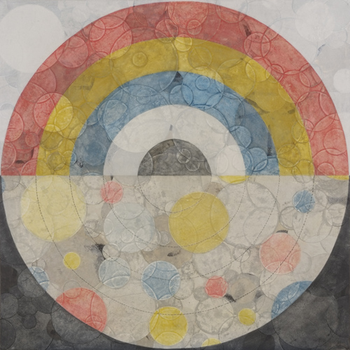
오정색무지개_103x103cm_장지.자연염료.분채.먹.콩즙_2009
2. 보편적 상징으로서의 원(circle)
한지와 오방색이 분명 한국 문화의 특수성이라 한다면 이영희가 구현한 화면에 일괄적으로 드러나는 원(circle)은 인류가 오랜 시간 일구어온 원형(原型, archetypes)으로서의 보편적인 상징인 것이다.
원은 우주, 태양 이미지에서 알, 자궁, 만다라, 이슬람 건축의 돔(dome)까지 시간과 공간을 초월한 절대적인 조형의 완전성과 의미의 신성한 확장을 보여준다. 원은 그 조형성을 보더라도 시간성과 공간성을 소멸시키며 영원한 순환과 회귀를 구축해 나가며 무한 확장해 나가는 에너지의 응집성을 확보하고 있다. 아른하임(Rudolf Arnheim)과 같은 게슈탈트(Gestalt)에 의하면 완전한 원형은 고요함이며, 원은 의지에 찬 행위에서 벗어난 이완의 보수로서만이 아니라 끊임없는 도전의 끊임없는 응전을 통해서만 유지된다고 한다. 작가가 반복적으로 부쳐나간 원형의 세계는 원 본연의 이러한 긴장감을 유지하며, 개개인이 정체성을 잃지 않고 밑과 위, 과거와 현재가 유기적인 관계를 맺으며 작용하고 있다. 원과 원이 겹쳐진 사이로 표류하는 사이의 공간은 유기적인 강한 끌림에 의해 먼 과거의 울림과 묘한 운동감을 전해준다. 이러한 중첩과 색의 깊이감은 이영희의 조형을 무한한 공간성의 확장과 이완으로 나간다고 할 수 있다.
또한, 콜라주로 붙여나간 겹겹의 원들로 가득 찬 화면은 끊임없이 자신의 정체성을 확인하는 ‘자기‘에의 확인의 과정으로 볼 수 있다. 자신의 정신을 구축하고 다시 구축함으로써 우주로의 존재론적인 확장을 보여주며 이는 또한 인간 보편적인 관념과 정신성으로 승화시키고 있다할 것이다. 이는 무의식의 부유하는 기억의 덩어리들처럼 빛바랜 추억들이 겹겹이 드러나며, 기억 속에 저장된 것은 사라져 버린 것인데도 불구하고 우리들은 현재에도 지속적인 과거의 되새김질을 경험하게 된다. 칼 야스퍼스(Karl Jaspers)에 의하면 모든 존재는 그 자체에 있어서 둥근 듯이 보인다라고 하였듯이 원이야 말로 인류의 본질을 담고 있는 것일 것이다. 즉, 원은 그 어떤 형상들보다도 더 서사적이며 역사적이며 서술적이다 라는 것이다.
오간색무지개_103x103cm_장지.자연염료.분채.먹.콩즙_2009
3. 세로토닌과 여성적 치유에 관하여
이영희의 회화는 천원지방(天圓地方)의 동양적 사고체계를 견고히 해석해 내고 있지만, 인류 보편적인 원형은 남성적인 직선과 대립하여 여성적이며 어머니의 자궁의 이미지를 강하게 제시하고 있다. 사실, 원으로 빚어진 조형의 공간과 천연재료에서 추출해낸 안료가 깊이 스며들어 빛나는 공간은 한국적 어머니의 정서와 추억이 빚어내는 고향의 향수를 불러일으킨다. 작가가 투박하고 견고하게 다듬어낸 화면을 대하면 어머니의 거친 손의 따스하고 깊은 숨결을 느끼게 되며, 푸른 하늘을 대면하고 바다를 향해 숨을 들이키는 것처럼 사랑을 담은 여성적 치유의 과정을 느끼게 한다. 풀을 찧어 환부에 부치는 치료사처럼. 이영희는 자연을 닮되 닮지 않은 하늘, 산, 무지개(빛) 모두 안으로 숨을 들이켜 버린 자연을 형상화하고 있다. 천연 재료에서 추출한 안료들의 고운 색은 찬란히 부서지며 방울방울 산란하는 빛을 형상화 한 듯하다. 눈이 부시며 화려하며 태양의 온화한 양분을 흠뻑 적셔줄 것 같은 풍부함이 담겨 있다. 표면에서 오래되고 정제된 안락한 빛이 나오며 이는 가시적인 경험의 빛이 아니라 오래되고 익숙한 관념의 빛으로 깊은 내면을 건드린다.
이들은 뇌에서 분비되는 신경계에 섬세하게 작용하는 세로토닌(serotonin)을 분비하게 하고 정신적인 건강과 안정을 취하도록 유도하고 있다. 불안한 현대인에게 필요한 것은 세로토닌 생성을 위한 생활방식의 전환인 것이다. 이것은 이영희의 작품세계에서 간과해선 안 될 특징인 것으로, 풍부한 정서적인 환기성과 내면의 정신적 세계를 음미하는 화면은 현대미술의 대안점과 방향성을 제시하고 있다. 과거로의 기억의 반추와 어머니과 같은 안온한 메아리를 던져주는 작가의 응축된 화면이 향후 어떠한 조형으로 다가올지 기대가 된다 하겠다.
오색무지개_120x120cm_장지.자연염료.분채.먹.콩즙.금분_2009
Memories of Stratum
Soo-Hyun Kim
Art Historian
Ms. Young-Hee Lee's artistic world reveals her long and steady process of searches for the Korean identity with the renditions of traditional colors and figures. Her coloration - an amalgam of her own colors that she creates from various natural raw materials - has a tinge of pre-trace of colors and may provoke the old issue of the relations between the traditional nature of colors and the Korean identity.
There were times when the identity issue was raised in the Korean art environment, particularly in the 1930s, the 1970s and the 1990s. The focal point in the 1930s was the identification of the Korean brown color akin to the Korean soil; in the 1970s and through the following twenty years, the search for the Korean colors placed a great significance on ecru as symbol of monochrome that is typical of the Korean white clothes. Finally, during the 1990s the searches for microscopic identities in the form of photographic and video arts by new generation artists have brought about the issues of the Korean identity of colors with new twists and turns.
Particularly during the 1990s when ideologies and social collective identities were gone in the midst of the post-modern cultures, the issue of the search for identity tended to place emphasis on personalized identities. These tendencies have given rise to a new issue of defining the relations between the colors and the Korean people's collective identity.
In this context, we need to recognize the significance of Ms. Lee's works. She provides various renditions of Ojungsaek or Five Basic Colors and Ogansaek or Five Related Colors and seeks to establish her stature in the contemporary Korean arts. Her diversified applications of these colors provoke certain tensions between artistic localism and globalism, which will in turn receive an increasing global attention in the long run.
Her colors typically express faded tones, as if they were perished and petrified walls. Hers also reveal dual images of folded and unfolded figures and create "a between space" through renditions of panoramic figures. The resulting artistic effect is the production of dual colors and spaces in the simultaneous space of surface and depth. In Ms. Lee's creative world of works, colors play a significant role. Through numerous strokes of colors in every detailed space on the canvas, she renders abstract perspectives and even repeats revelation and concealment of the spaces of strata, thereby prompting the effect that these unique images are ultimately stored in the memories of the viewers.
오색무지개_103x103cm_장지.자연염료.분채.먹.콩즙_2009
The visual effects are most striking when she conveys matiere effect through an exaggerated rendition of the space with multiple applications of color materials. While transparent and semi-transparent space effects are revealed, her works express the space within the space inside her materials. As if they were the sheepskin of memories, her works unfold a world of a thousands of plateau and bring back the memories of the grand mothers of old ages through unique colors of celadon and old orange yellow and finally invite the ghosts of the pre-traces of existence.
Her concise and geometrical figures provide certain values that are incremental to the Korean people's collective memories of the old times. Repetition and accumulation of her colors on her artistic space could be metaphoric of the skies and the universe, endless repetition of circles being symbolic of the great universe and the rectangular space being representative of the land. These figures are shown in the process of repetition and accumulation in her space, creating the space that is somehow free and almost with the sense of floating around in a gravity-free state.
As typified in the age of mono-color during the 1970s, the artistic journey of the applications of repetitions would transform one from a physical to a spiritual state. The journey itself is the Korean identity of endurance and perseverance that has been revealed and accumulated through thousands of years of the Korean history. Her old colors hidden in her numerous strokes of detailed colors render the effects as if they were archeological strata and recollect the memories of our identity that ought to be preserved in the future.
■ 이영희
중앙대학교 대학원 한국화학과 졸업
개인전 | 2009 | 제9회개인전<오색무지개> (한국 서울, 가나아트스페이스/인더박스갤러리) | 2009 | 제8회개인전<청산록수> (한국 부산, BEXCO) | 2008 | 제7회개인전<소통-색의 창> (한국 서울, COEX) | 2008 | 제6회개인전<소통-화와 획> (중국 심양, 요녕미술관) | 2007 | 제5회개인전<소통-오랜 편지> (한국 서울, 목인갤러리) | 2006 | 제4회개인전<역사의 창> (미국 SANDIEGO, CJ갤러리) | 2005 | 제3회개인전<역사의 창> (일본 동경, 한국문화원) | 2005 | 제2회개인전<의식의 창> (미국 L.A, Jim Harter갤러리) | 2004 | 제1회개인전<의식의 창> (한국 서울, 공화랑)
수상 | 제37회구상전우수상 (성남, 성남아트센타) | 제36회구상전특선 (성남, 성남아트센타) | 제25회대한민국미술대전-비구상부문입선 (과천, 국립현대미술관) | 제23회대한민국미술대전-비구상부문입선 (과천, 국립현대미술관) | 제22회대한민국미술대전-비구상부문입선 (과천, 국립현대미술관) | 2003단원미술대전입선 (안산, 단원전시관) | 제32회구상전입선 (과천, 국립현대미술관) | 제14회한국화특장전국공모대전입선 (광주, 비엔날레전시관) | 제31회구상전입선 (과천, 국립현대미술관) | 제7회소사벌미술대전입선 (평택, 평택호미술관) | 제30회구상전입선 (과천, 국립현대미술관) | 제1회대한민국여성미술대전동상 (서울, 세종문화회관)
현재 | 중앙대학교 예술대학 한국화학과 출강 | 한국색연구소 소장
연락처 | 서울시 송파구 오금동44 현대아파트 39-601 | Home 02.402.1750 C.P 011-244-9039 | e-mail: yhlee0620@hotmail.com | 웹사이트: https://leeyh.com
vol. 20100301-이영희展